Layered Illustrator Styles
iaian7 » tutorials » illustrator John Einselen, 26.09.11 (updated 15.11.11)Whenever I’m given the chance, I love building procedural effects. Instead of spending a couple hours illustrating type effects in Illustrator, I’d much rather build a layer style that does it for me; then when the inevitable change requests start pouring in, I just retype the text instead of starting over on an illustration. While this approach isn’t appropriate in all cases, it can be a great way to make the production process just a little bit more flexible for everyone involved.

This tutorial will go through the steps I used to create a comic style text effect for a project at Vectorform. This was quickly modified for a lot of menu items, making additional UI elements as simple to create as typing.
Text preparation
 To follow along with the screen captures, you’ll want to use Komika Display (free download) set to 160 points. Kern by hand for the best results, though setting it to Optical should be close.

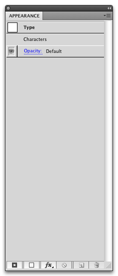 While just about any element in Illustrator will use a default fill and stroke style, text objects actually contain their own fill and stroke applied on top of any other layer effects; it shows up as “Characters” in the Appearance panel and is largely useless when it comes to custom styles. Not sure why Adobe implemented it this way, but it means our first step when dealing with text is going to be setting the unmodifiable character fill and stroke to invisible.
  Select your text layer, then select the fill or stroke in the Colour palette and apply Transparent (the white box with a red line through it). Your text will look like it’s gone. Fear not! It’s still there, we just need to apply our own fill now by clicking the Add New Fill button along the bottom of the Appearance panel (this will automatically add an empty stroke as well, but we’ll ignore it for this tutorial).
Distortions and effect ordering

 Effects such as Warp, Transform, and other path modifications are applied to the entire object by default, but it’s important to note that we can apply them both before and after the fill and stroke are applied! Illustrator has a few quirks when it comes to layering (such as the unmodifiable Character style), but any effects applied at the top of the list will affect the object before strokes and fills are applied, while effects applied to the bottom of the list will affect the object after strokes and fills are applied. Though distortion effects are unable to modify gradient colours, effects such as Transform rotation do, which means the order in which they’re applied is important. For example, if we apply a Transform effect before any gradients, the gradients are applied as if the object were originally that transformed shape. If we apply a Transform effect after gradients, the gradients are transformed along with the object shape.
 Now we get to the really quirky part; effects are applied in descending order (applied top first to the bottom last), but fills and strokes are rendered in ascending order (fill and stroke layers at the bottom of the stack will appear underneath fill and stroke layers higher up in the stack).


 While it doesn’t really matter too much how you set up the gradient rotations, I’ve chosen to apply a wave warp first and align my gradients to that. Afterwards, I’m rotating the text to work better in the final UI design by applying a Transform effect at the bottom of the stack (remember, effects are applied top-to-bottom, so any effects at the bottom of the list will be applied last).

Path modifications
Of course, that’s just the beginning of what can be done with nondestructive effects; you can apply them to specific fill and stroke layers as well! While I’m only using a couple basic effects here, the list is lengthy, and the possibilities are pretty broad. For example, you could use Rounded Corners and Roughen to dynamically weather otherwise pristine edges, without adding any complexity to the underlying object. This is great for text objects (since they remain editable), but also works well for other shapes, since you can work with simple geometry while rendering more detailed effects dynamically.


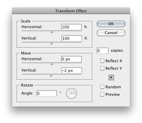 To add a bit of glossy shine along the top of the text, I’m adding a new fill layer (either click the Add New Fill button or the Duplicate Selected Item button) and then adding an Offset Path effect by either selecting the layer and applying the effect directly, or applying the effect to the object then dragging it onto the correct fill layer (effects can also be easily duplicated by option-click-dragging). By contracting the fill layer by a few pixels, I get the basic shape of a highlight, then shift it using a Transform effect so it hugs the top of the letters better. Changing the fill to a quick transparent gradient completes the effect.
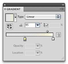 Note the use of a yellow in the transparent portion of the highlight gradient; Illustrator (like Photoshop) will interpolate RGBA values individually (not alpha first), so using a 0% opacity yellow means the white will gradually become more yellow as it completely fades out. This results in far more vibrant highlight tones, and prevents the grayish feeling often found in pure white highlights at partial transparency.
Faking depth
While the text is intended to match a 2D illustrated style, a small amount of depth goes a long way in making it stand out, and I wanted the text to feel a little more engaging and touchable.


 Possibly the most powerful feature of the Transform effect is the Copies setting. This will clone the affected item any number of times (either the entire object or specific fill or stroke layers it’s applied to), recursively applying the transform effect to each copy. With some small numbers (half pixel measurements can be better when sharper corners are involved), we can quickly build out a sudo 3D object very quickly! Be careful though, too many copies on a complex object can really slow things down, so keep it conservative if you want to retain responsiveness in Illustrator.
Finishing up


 To finish up the style, I’ve added an outline using the Path Offset and Transform effects applied to a simple black fill underneath all the other layers. Because of the positioning, it feels like an organic variable stroke, though it’s actually far simpler than that.

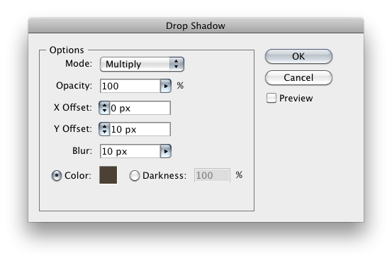 So far we’ve only used vector effects, but Illustrator supports a long list of raster effects as well. Depending on your document settings (which control the rasterisation resolution as a function of DPI), the results can be pretty usable. In this case, I’ve just added a simple Drop Shadow to help ground the type and blend in with the other design elements.

Final assets always change
As mentioned in the beginning of this article, the true power of all these effects is that they’re completely dynamic. Do you need to change the capitalisation? Fix a spelling error? Update the image with a different word? Reuse the same style elsewhere?
No problem. Illustrator will update and apply the style as you type!

Project file
You can download the Adobe Illustrator file from the Vectorform Labs blog post.
1finished Illustrator layer style
Taking it further
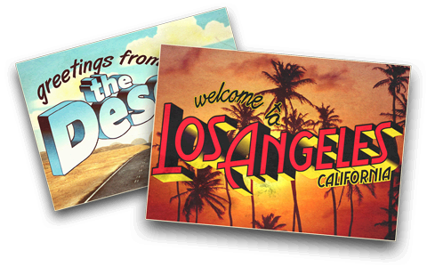
Of course all of this barely scratches the surface, by combining and inventing new techniques you can take it so much further. A couple years ago Vectorform needed some retro-styled postcards for an educational racing game, and by utilising combinations of simple Illustrator effects, the varied typographic treatments were built entirely with dynamic layer styles.
Adobe and Illustrator are either registered trademarks or trademarks of Adobe Systems Incorporated in the United States and/or other countries.
 mediaboxAdvanced