Tron: Illustrated
iaian7 » tutorials » lightwave John Einselen, 29.11.11 (updated 4.01.12)At Vectorform we get to work on a lot of high profile brands, and Disney’s Tron: Legacy HTML5 online graphic novel experience was no exception! Given a tight deadline, we created an interactive graphic novel that leveraged animations, effects, and audio made possible by the latest HTML5 technology.
Such a cool experience needed a unique intro screen and loading animation, something that was a bit more specialised than just a simple bar. Working on two rotating pieces that would lock together at 100%, I knew the style would need to remain consistent with the established look of the graphic novel, ink strokes and all. Instead of trying to illustrate each animation frame by hand, I turned to Lightwave.
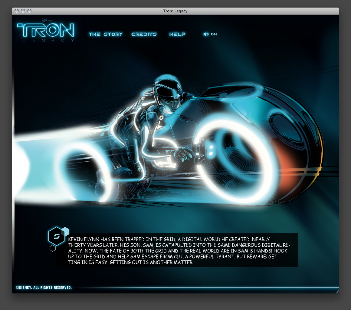
When developing shaders, be they photoreal or painterly, it’s always helpful to break the desired look down into easily replicable components. Using the cover illustration of the Tron graphic novel as a guide, we can see layers of base painting (smooth gradations), highlight brushing (smudgier daubs), and ink strokes (shading lines that follow the curves of the object).

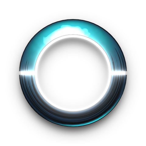
The base object is a simple donut shape with strong backlighting. Specialised surface development will almost always require a specific lighting setup to work well, and this is no exception. The style is of course flexible enough to be adapted elsewhere, but for tight control over the results we need to keep the lighting unchanged.
Ink strokes

 At first glance this seems a little odd to try and replicate in 3D, but it’s easier than you might think. Using the crust procedural texture, we’ll stretch out the X and Y to give long strokes against the side of the object, then connect a Lambert shading node to the spot size input to control the thickness of the strokes.
 With the addition of incidence and gradient nodes, we’ll adjust some of the shading subtleties, especially around the edges of objects where we want more of an outline. In simple cases like this, using an incidence gradient to outline an object can give smoother and more reliable results than Lightwave’s line renderer, plus allows us to add a thin white edge between the outline and the shading to help add a bit more definition. In more organic or complex models an incidence stroke is quite variable, which can either be good or bad depending on the desired style.

This works great for such a circular shape, but if an object is more organic or has lines that are harder to follow with a procedural texture, you’ll want to explore more options, including variations on the type of procedural, direction, or even other mapping setups. Cross-hatched techniques were demoed a few years ago on the Newtek Ligthwave forums by William Vaughan, and I’ve used variations on other projects as well. It’s surprising how well some pen and ink styles can be adapted to a Lightwave surface style using basic node setups.
Base coloration
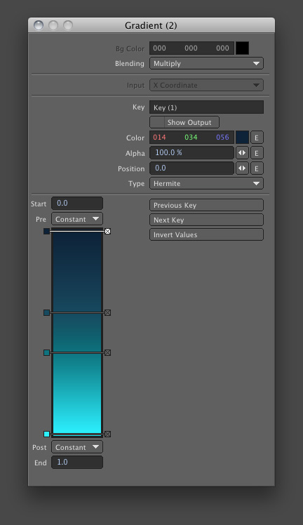
 Hues rarely remain constant through gradations of shading and light; not in real life, not in photography, not in illustrations, and, I hope, not in our 3D renders! We’ll take the same Lambert diffuse shading node used for the ink strokes, and add a gradient to create the base coloration. From deeper purple-blues to bright cyans, the hue shifts create life and depth in the surface. Mixing the Lambert diffuse shading with Phong specularity helps make the lighting falloff feel more metallic. Plus, what better way to pay homage to Tron than with an historic shading method? Always warms my heart to find unique ways of mixing in stuff like that.

 The colours work well enough, but it doesn’t feel particularly painterly without more surface variation. With cross-hatched crust nodes, we’ll use Denis Pontonnier’s DPkit Bump Normal node to convert the resulting bump values into normals that can be plugged into the Lambert and Phong shaders. Directly controlling normals like this is a great way to mix varied effects in the same surface, without being limited to a single global bump.

Highlight painting
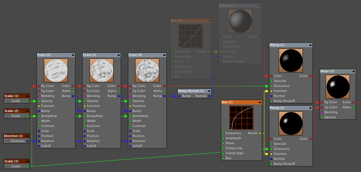 Just about complete, the only thing left to add is the highlights. Using multiple Phong shaders allows us to mix both painterly and shiny surface properties easily. Using the cross hatched crust nodes already set up for the diffuse normals, we’ll modulate the shininess of the second one to give more brush stroke style shapes. Rather like a two-coat surface process, but with more organic results.

 With the combination of normals, procedural stroke widths, and highlight modulations, the surface can react much like an illustration, but the patterns are essentially attached to the surface and completely stable during animation.
You can visit the Tron HTML5 website to see the loading animation in action!
Download
The .zip file contains the final sample scene, object, and an exported surface file for easy addition to a presets collection. There are a fair number of nodes that weren’t described in detail, so reviewing the setup by playing around with the pieces is the best way to really tear things apart. Enjoy!
This surface requires the Bump Normal node found in Denis Pontonnier’s excellent (and free!) DPkit.
Disney and Tron are either registered trademarks or trademarks of Disney in the United States and/or other countries.
Newtek and Lightwave 3D are either registered trademarks or trademarks of Newtek Incorporated in the United States and/or other countries.
 mediaboxAdvanced